Visualization and Education
An important part of our research is the development of educational tools and frameworks that can help students and professionals learn how to create effective visualizations. We have developed several frameworks, such as the Five-Design Sheets (FDS), which provides a structured approach to visualization design, and the Explanatory Visualization Framework (EVF), which focuses on teaching creative computing through visualization. Our latest work, the Critical Design Strategy (CDS), introduces a structured heuristic evaluation method designed to facilitate the examination of visualization designs through reflection and critical thought.
Related Publications
J. C. Roberts, H. Alnjar, A. E. Owen, and P. D. Ritsos, “Critical Design Strategy: a Method for Heuristically Evaluating Visualisation Designs,” IEEE Transactions on Visualization and Computer Graphics, vol. 32, no. 1, pp. 1383–1393, Jan. 2026.
We present the Critical Design Strategy (CDS)—a structured method designed to facilitate the examination of visualisation designs through reflection and critical thought. The CDS helps designers think critically and make informed improvements using heuristic evaluation. When developing a visual tool or pioneering a novel visualisation approach, identifying areas for enhancement can be challenging. Critical thinking is particularly crucial for visualisation designers and tool developers, especially those new to the field, such as studying visualisation in higher education. The CDS consists of three stages across six perspectives: Stage 1 captures the essence of the idea by assigning an indicative title and selecting five adjectives (from twenty options) to form initial impressions of the design. Stage 2 involves an in-depth critique using 30 heuristic questions spanning six key perspectives—user, environment, interface, components, design, and visual marks. Stage 3 focuses on synthesising insights, reflecting on design decisions, and determining the next steps forward. We introduce the CDS and explore its use across three visualisation modules in both undergraduate and postgraduate courses. Our longstanding experience with the CDS has allowed us to refine and develop it over time: from its initial creation through workshops in 2017/18 to improvements in wording and the development of two applications by 2020, followed by the expansion of support notes and refinement of heuristics through 2023; while using it in our teaching each year. This sustained use allows us to reflect on its practical application and offer guidance on how others can incorporate it into their own work.
[Abstract]
[Details]
[PDF]
[Preprint]
[doi:10.1109/TVCG.2025.3634783]
[Presented at IEEE VIS 2025]
C. C. Gray, D. Perkins, and P. D. Ritsos, “Degree Pictures: Visualizing the university student journey,” Assessment & Evaluation in Higher Education, vol. 20, no. 4, pp. 568–578, Aug. 2020.
The field of learning analytics is progressing at a rapid rate. New tools, with ever-increasing number of features and a plethora of datasets that are increasingly utilized demonstrate the evolution and multifaceted nature of the field. In particular, the depth and scope of insight that can be gleaned from analysing related datasets can have a significant, and positive, effect in educational practices. We introduce the concept of degree pictures, a symbolic overview of students’ achievement. Degree pictures are small visualizations that depict graphically 16 categories of overall student achievement, over the duration of a higher education course. They offer a quick summary of students’ achievement and are intended to initiate appropriate responses, such as teaching and pastoral interventions. This can address the subjective nature of assessment, by providing a method for educators to calibrate their own marking practices by showing an overview of any cohort. We present a prototype implementation of degree pictures, which was evaluated within our School of Computer Science, with favourable results.
[Abstract]
[Details]
[PDF]
[doi:10.1080/02602938.2019.1676397]
D. Dave Perkins, C. C. Gray, P. D. R. Ritsos, and L. I. Kuncheva, “JISC/Bangor University Learning Analytics Project Summary & Case Study,” JISC, UK & Bangor University, Commissioned Report, 2020.
Insights into activities we undertake as educators and students have the potential to enhance learning and reduce unintentional consequences for all. Educators have for a long time used data to monitor students and grade them. More recently additional yet still traditional metrics have been added to the available tools in every day education. The latest generation of information are derived metrics with additional intelligence. This project has developed a Work Pressure metric than can be used by both educator and learner. The focus is on the assessments for a given programme and Work Pressure that this generates. Additionally, included is behavioural characteristics, these have the potential to have significant impact upon the individual student journey.
[Abstract]
[Details]
[PDF]
J. C. Roberts, P. D. Ritsos, J. Jackson, and C. Headleand, “The explanatory visualization framework: An active learning framework for teaching creative computing using explanatory visualizations,” IEEE Transactions on Visualization and Computer Graphics, vol. 24, no. 1, pp. 791–801, Jan. 2018.
Visualizations are nowadays appearing in popular media and are used everyday in the workplace. This democratisation of visualization challenges educators to develop effective learning strategies, in order to train the next generation of creative visualization specialists. There is high demand for skilled individuals who can analyse a problem, consider alternative designs, develop new visualizations, and be creative and innovative. Our three-stage framework, leads the learner through a series of tasks, each designed to develop different skills necessary for coming up with creative, innovative, effective, and purposeful visualizations. For that, we get the learners to create an explanatory visualization of an algorithm of their choice. By making an algorithm choice, and by following an active-learning and project-based strategy, the learners take ownership of a particular visualization challenge. They become enthusiastic to develop good results and learn different creative skills on their learning journey.
[Abstract]
[Details]
[PDF]
[doi: 10.1109/TVCG.2017.2745878]
[Presented at IEEE VIS 2017]
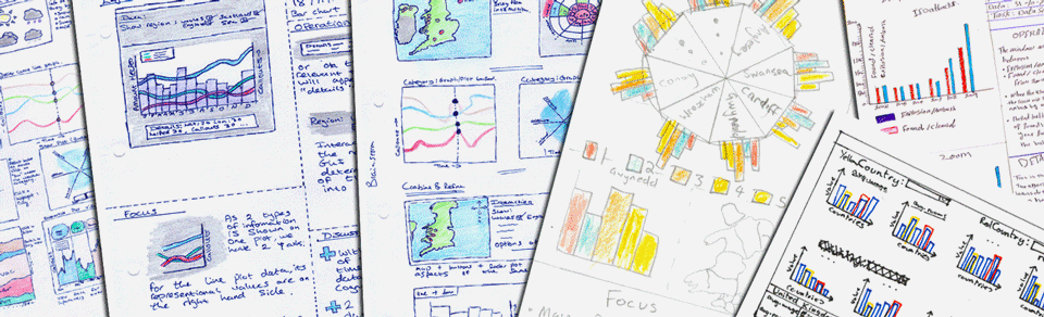
J. C. Roberts, P. D. Ritsos, and C. Headleand, “Experience and Guidance for the use of Sketching and low-fidelity Visualisation-design in teaching,” in Pedagogy of Data Visualization Workshop, IEEE Conference on Visualization (VIS), Phoenix, Arizona, USA, 2017.
We, like other educators, are keen to develop the next generation of visualisation designers. The use of sketching and low-fidelity designs are becoming popular methods to help developers and students consider many alternative ideas and plan what they should build. But especially within an education setting, there are often many issues that challenge students as they create low-fidelity prototypes. Students can be unwilling to contemplate alternatives, reluctant to use pens and paper, or sketch on paper, and inclined to code the first idea in their mind. In this paper we discuss these issues, and investigate strategies to help increase the breadth of low-fidelity designs, especially for developing data-visualisation tools. We draw together experiences and advice of how we have used the Five Design-Sheets method over eight years, for different assessment styles and across two institutions. This paper would be useful for anyone who wishes to use sketching in their teaching, or to improve their own experiences.
[Abstract]
[Details]
[PDF]
J. C. Roberts, C. J. Headleand, and P. D. Ritsos, Five Design-Sheets: Creative Design and Sketching for Computing and Visualisation. Springer, 2017.
This book describes a structured sketching methodology to help you create alternative design ideas and sketch them on paper. The Five Design-Sheet method acts as a check-list of tasks, to help you think through the problem, create new ideas and to reflect upon the suitability of each idea. To complement the FdS method, we present practical sketching techniques, discuss problem solving, consider professional and ethical issues of designing interfaces, and work through many examples. Five Design-Sheets: Creative Design and Sketching for Computing and Visualization is useful for designers of computer interfaces, or researchers needing to explore alternative solutions in any field. It is written for anyone who is studying on a computing course and needs to design a computing-interface or create a well-structured design chapter for their dissertation, for example. We do acknowledge that throughout this book we focus on the creation of interactive software tools, and use the case study of building data-visualization tools. We have however, tried to keep the techniques general enough such that it is beneficial for a wide range of people, with different challenges and different situations, and for different applications.
[About]
[Details]
[ISBN:978-3319556260]
J. C. Roberts, C. Headleand, and P. D. Ritsos, “Half-day Tutorial on Sketching Visualization designs, and using the Five Design-Sheet (FdS) Methodology in Teaching,” in Tutorials of at the IEEE Conference on Visualization (IEEE VIS 2017), Phoenix, AZ, USA, 2017.
This tutorial leads attendees through sketching designs following the Five Design-Sheet methodology (FdS) and discusses how it can be used in teaching. The first part (before the break) will introduce the FdS, place it in context with other methods, discuss creative thinking and different problem types, explain the benefit of sketching designs, and provide a worked example of the FdS. The second part (after the break) focuses on using the FdS in teaching in Higher Education We give examples of students’ work, and discuss issues and challenges of using sketching for designing and prototyping in teaching, followed by a question and answer session.
[Abstract]
[Details]
[PDF]
J. C. Roberts, C. Headleand, and P. D. Ritsos, “Sketching Designs for Data-Visualization using the Five Design-Sheet Methodology,” in Tutorials of at the IEEE Conference on Visualization (IEEE VIS 2016), Baltimore, MD, USA, 2016.
The tutorial will be useful for anyone who has to create visualization interfaces, and needs to think through different potential ways to display their data. At the end of the tutorial participants will understand techniques to help them be more structured in their ideation. They will be able to sketch interface designs using the Five Design Sheet methodology (FdS). While we know that some developers have started to use the Five Design-Sheet methodology, but this tutorial will start from the beginning and be suitable for any attendee. More information and resources are found on http://fds.design.
[Abstract]
[Details]
[PDF]
J. C. Roberts, J. Jackson, C. Headleand, and P. D. Ritsos, “Creating Explanatory Visualizations of Algorithms for Active Learning,” in Posters presented at the IEEE Conference on Visualization (IEEE VIS 2016), Baltimore, MD, USA, 2016.
Visualizations have been used to explain algorithms to learners, in order to help them understand complex processes. These ‘explanatory visualizations’ can help learners understand computer algorithms and data-structures. But most are created by an educator and merely watched by the learner. In this paper, we explain how we get learners to plan and develop their own explanatory visualizations of algorithms. By actively developing their own visualizations learners gain a deeper insight of the algorithms that they are explaining. These depictions can also help other learners understand the algorithm.
[Abstract]
[Details]
[PDF]
J. C. Roberts, C. Headleand, and P. D. Ritsos, “Sketching Designs Using the Five Design-Sheet Methodology,” IEEE Transactions on Visualization and Computer Graphics, vol. 22, no. 1, pp. 419–428, Jan. 2016.
Sketching designs has been shown to be a useful way of planning and considering alternative solutions. The use of lo-fidelity prototyping, especially paper-based sketching, can save time, money and converge to better solutions more quickly. However, this design process is often viewed to be too informal. Consequently users do not know how to manage their thoughts and ideas (to first think divergently, to then finally converge on a suitable solution). We present the Five Design Sheet (FdS) methodology. The methodology enables users to create information visualization interfaces through lo-fidelity methods. Users sketch and plan their ideas, helping them express different possibilities, think through these ideas to consider their potential effectiveness as solutions to the task (sheet 1); they create three principle designs (sheets 2,3 and 4); before converging on a final realization design that can then be implemented (sheet 5). In this article, we present (i) a review of the use of sketching as a planning method for visualization and the benefits of sketching, (ii) a detailed description of the Five Design Sheet (FdS) methodology, and (iii) an evaluation of the FdS using the System Usability Scale, along with a case-study of its use in industry and experience of its use in teaching.
[Abstract]
[Details]
[PDF]
[doi:10.1109/TVCG.2015.2467271]
[Presented at IEEE VIS 2015]
J. C. Roberts, C. Headleand, D. Perkins, and P. D. Ritsos, “Personal Visualisation for Learning,” in Personal Visualization: Exploring Data in Everyday Life Workshop, IEEE Conference on Visualization (VIS), Chicago, IL, USA, 2015.
Learners have personal data, such as grades, feedback and statistics on how they fair or compare with the class. But, data focusing on their personal learning is lacking, as it does not get updated regularly (being updated at the end of a taught session) and the displayed information is generally a single grade. Consequently, it is difficult for students to use this information to adapt their behavior, and help them on their learning journey. Yet, there is a rich set of data that could be captured and help students learn better. What is required is dynamically, regularly updated personal data, that is displayed to students in a timely way. Such ‘personal data’ can be presented to the student through ‘personal visualizations’ that engender ‘personal learning’. In this paper we discuss our journey into developing learning systems and our resulting experience with learners. We present a vision, to integrate new technologies and visualization solutions, in order to encourage and develop personal learning that employs the visualization of personal learning data.
[Abstract]
[Details]
[PDF]
P. D. Ritsos and J. C. Roberts, “Towards more Visual Analytics in Learning Analytics,” in EuroVis Workshop on Visual Analytics (EuroVA), Swansea, UK, 2014, pp. 61–65.
Learning Analytics is the collection, management and analysis of students’ learning. It is used to enable teachers
to understand how their students are progressing and for learners to ascertain how well they are performing.
Often the data is displayed through dashboards. However, there is a huge opportunity to include more comprehensive
and interactive visualizations that provide visual depictions and analysis throughout the lifetime of the
learner, monitoring their progress from novices to experts. We therefore encourage researchers to take a comprehensive
approach and re-think how visual analytics can be applied to the learning environment, and develop more
interactive and exploratory interfaces for the learner and teacher.
[Abstract]
[Details]
[PDF]